
When I was a kid, our family got a roll of film developed every couple of months, and I remember getting the envelope of 4×6 prints back from the lab and hearing my mom remind me not to touch the prints.
“You’ll get fingerprints on them,” she’d say.
Not one to waste a good metaphor, as an adult, that’s all I really want from my photography: to make photographs with my fingerprints—my unique mark—all over them. I want my work to be more and more my own. We don’t all photograph for the same reasons, but I know this desire isn’t unique to me: I know that while most of us want to make images that are good or compelling, it’s more meaningful if those images are truly yours.
That’s photographic voice, and it’s not an easy thing to find (or create) in your work. But when you do, and you make a photograph or a series of images that feels like it’s really “you,” there are few feelings that compare.
Voice can come across in many ways in your images. For some photographers, it’s how you compose and your choice of subjects; for others, it’s a certain technique, like Valda Bailey’s abstracts and impressionism which I pointed you to last week (LINK). For some, it’s the kind of black and white treatment you use, and still for others, it’s the way you use or control colour. For most of us, it’s some particular combination of all of those and many more.
Voice is found in your choices about those things and the harmony between them, who you are, and what you’re trying to say.
The world of cinematography isn’t so different from still photography, but cinematographers seem to be much more conscious about some of these choices, specifically colour. I’ve spent the last year deepening my understanding of, or sensitivity to, colour, mostly because I felt that a photographer who uses colour (which I do as much as I also use monochrome) should probably be more aware of this profound tool for visual expression than I have been at times.
Colour is a big topic. So big that it can be really confusing, especially when you start breaking out colour wheels and talking about colour modes and spaces and the nitty gritty science of it. I’m less interested in these than I am in how colour makes us feel, how we read and respond to colour in photographs, and how we use it to express the subjects, ideas, or moods in our images.
To that end, I’ve got three ideas I want to offer up for your consideration where more creative and personal use of colour is concerned.
1. Become more aware of how colour makes you feel.
It’s got to begin with you because while it’s easy to make blanket observations about how red is a more passionate colour and yellow is a happy colour, there are a million different kinds of red, or yellow, and not all of them make us feel the same way.
A bright warm yellow is not emotionally the same as a light pastel yellow; they feel different. They pull our eyes differently, and they pull our thoughts and emotions differently as well. One shade of red feels passionate, another feels powerful, and still another—like a soft pink—might feel delicate and innocent, the opposites of passion or seduction or power.
Becoming more aware of the colours you actually see and how you respond to them as you react to the world and the photographs around you (as well as which colours and combinations you prefer and those you don’t) is a first step in using colour more intentionally and creatively.
Honing your sensitivity to colour will make you a much stronger colour photographer.
2. Become more aware of the qualities of colour.
Go back in your mind to the different associations I just mentioned about the colour red. There are warmer reds and cooler reds, softer reds, and brighter reds. We give them all kinds of names: fire truck red, garnet, scarlet, pink. All of them feel different. Here are a few more:
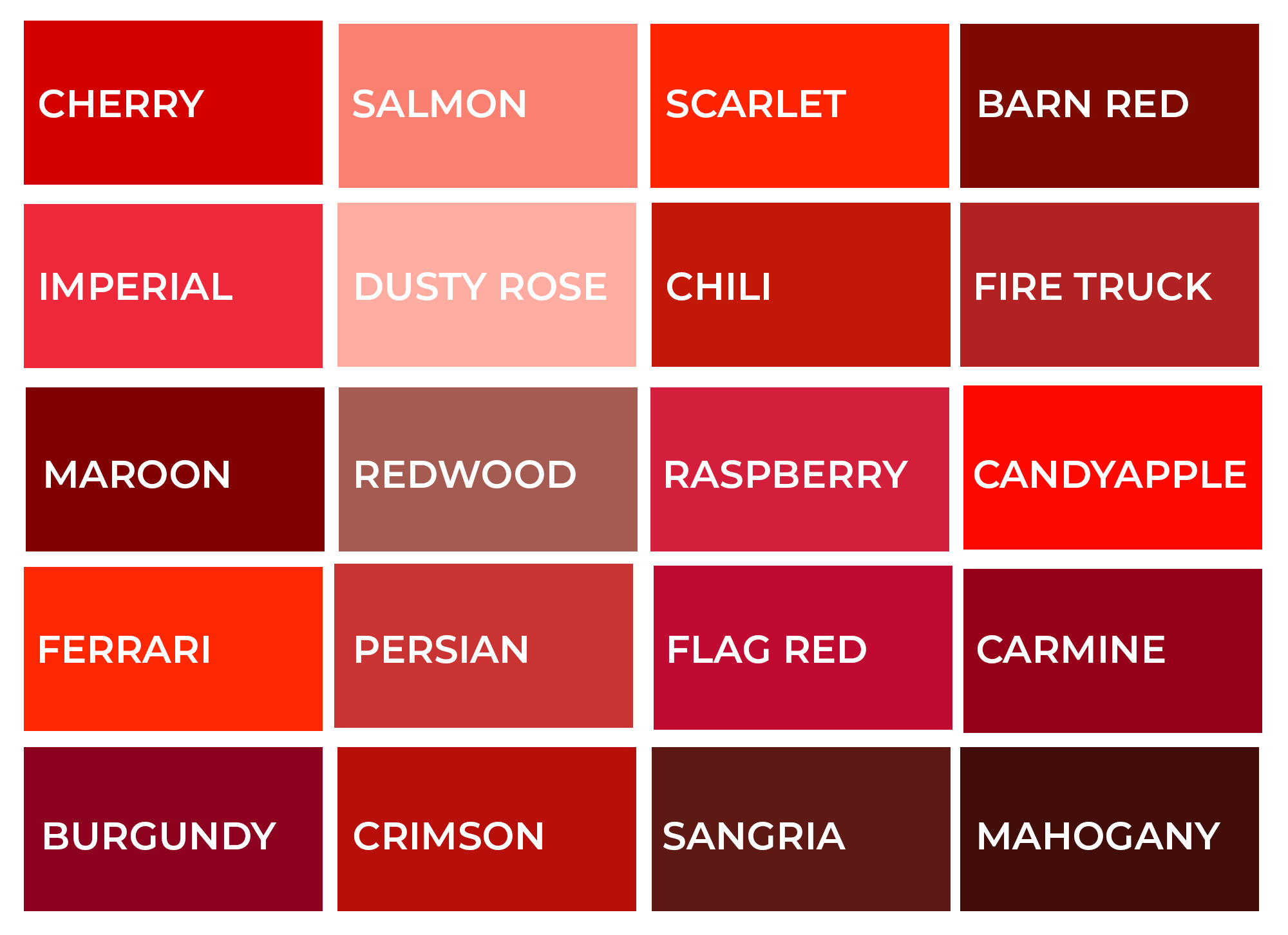
Being more aware of the full gamut of red’s possibilities and being more sensitive to how you feel about them is a good first step. But I think we need to go further. To do that, you need to understand and be thinking about the three qualities of colour that make Mahogany, for example, different from Dusty Rose.
Any one colour can be described with just three characteristics: hue, saturation, and luminance. That’s it. With these three handles, we can describe (and then control) any colour.
Hue is what we normally think of as colour. When we say “it’s green” or “it’s red,” we’re talking about hue, though not with any real nuance.
Saturation is how intense that hue is, as in bright green or dull green. In the grid above, Candyapple is much more saturated than Dusty Rose; it’s more intense.
And luminance is how we describe that hue in terms of how light or dark it is. Dusty Rose (see above) is a very light red in terms of luminance, and Mahogany is very dark. But either Dusty Rose or Mahogany could also be a little warmer or cooler (a shift in hue) until they become a different “colour” entirely or more or less saturated. How you feel about any combination of hue, saturation, or luminance, will differ, and so too will how the colours work together.
When you stop calling colours by their popular names and become more able to identify them according to the qualities of hue, saturation, and luminance, you’ll be better able to control any or all of those qualities and better control how the colours in your image work together and make the photograph feel. This leads me to the third idea: control.
3. Become more controlling with colour.
When you become more sensitive to how colours contribute to the feel or the messaging of a photograph, and you gain a growing sense of the qualities of those colours, you have the ability to control them in the photograph. “What should I do to the colour in this image?” isn’t a helpful question, but “How could I change the hue, saturation, or luminance in areas of my image to change how they work together?” is a great question. And any photo manipulation tool worth its salt, like Adobe Photoshop or Lightroom, has tools to give you that specific control.
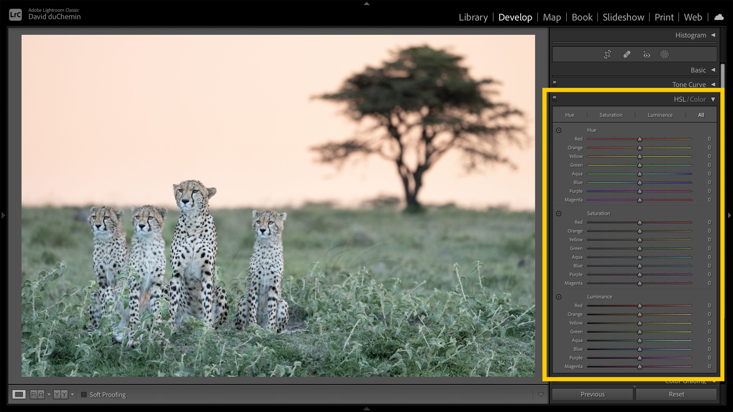
In Adobe Lightroom, shown here with HSL tools visible, each slider controls either hue, saturation, or luminance in the chosen colours on the left. This alone will change your control over colour forever.
Once you understand the qualities of colour in terms of hue, saturation, and luminance (HSL), you can use the HSL tools to push them around, making certain colours warmer or cooler (hue), brighter or less intense (saturation), and/or lighter or darker (luminance). Here are some examples using the HSL panel in Adobe Lightroom.
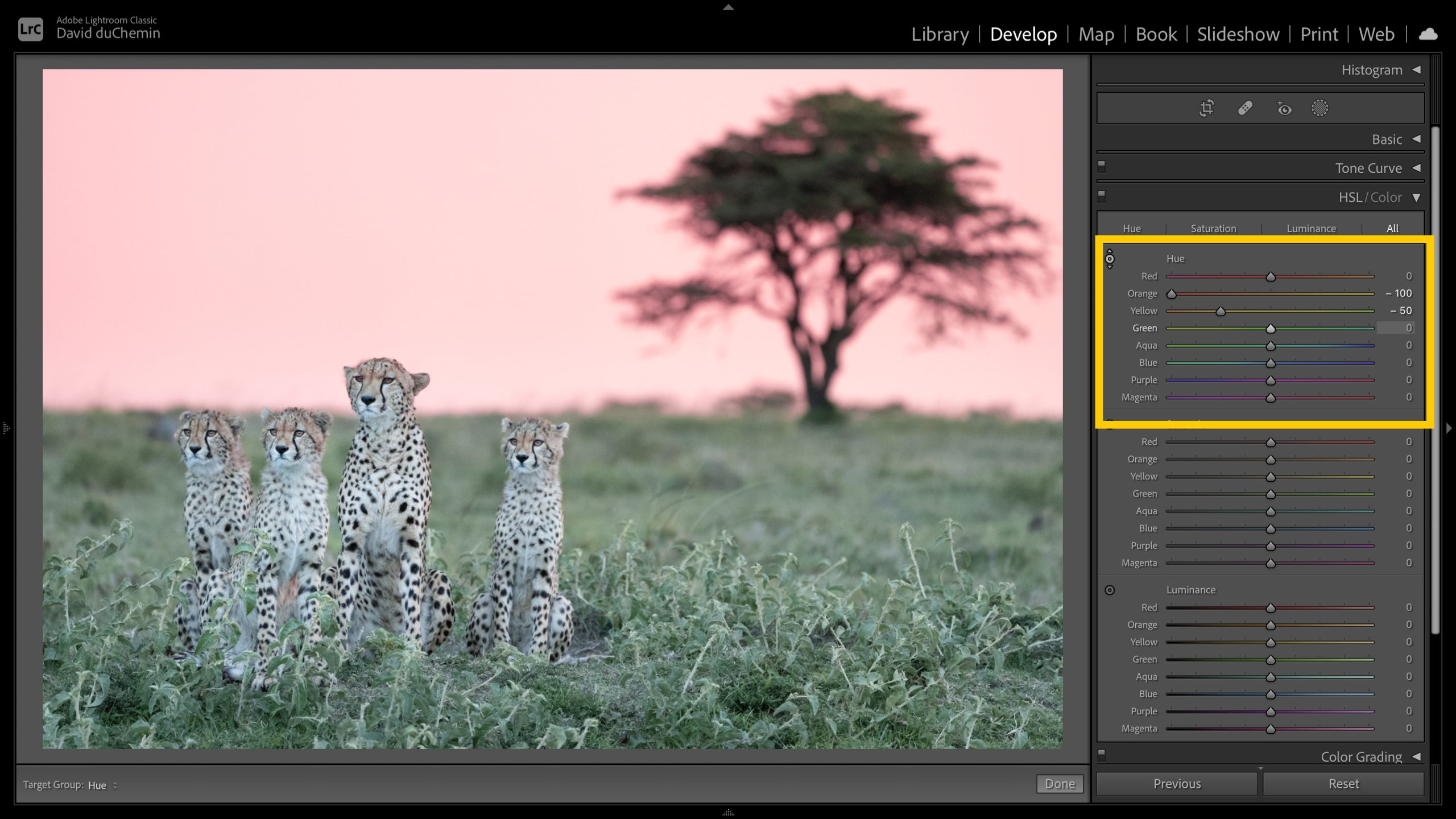
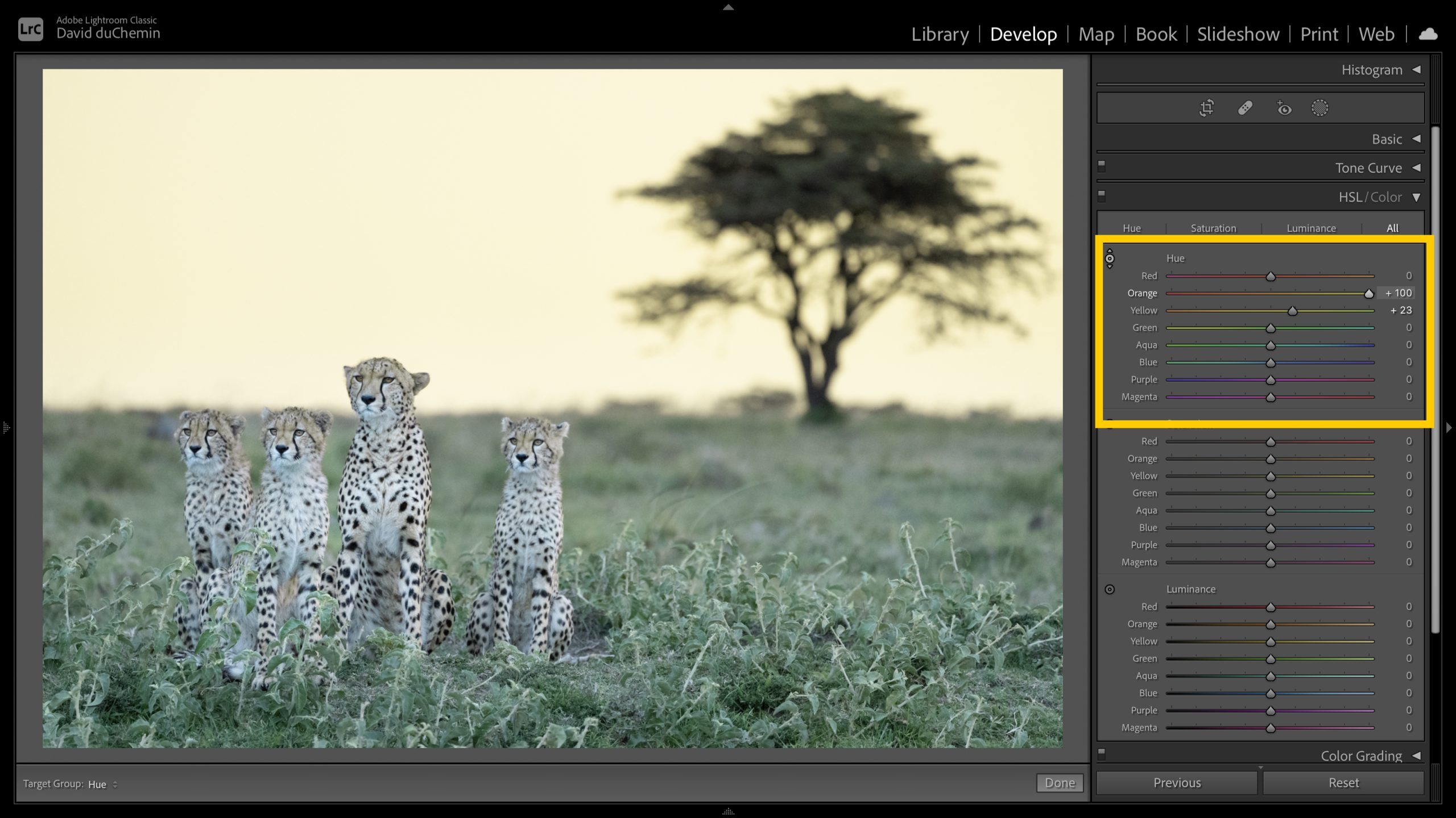
Hue.
In the Hue section of the HSL Panel in Lightroom I’ve adjusted the hue in the oranges and yellows more towards the reds in the top image and towards the greens in the second image.
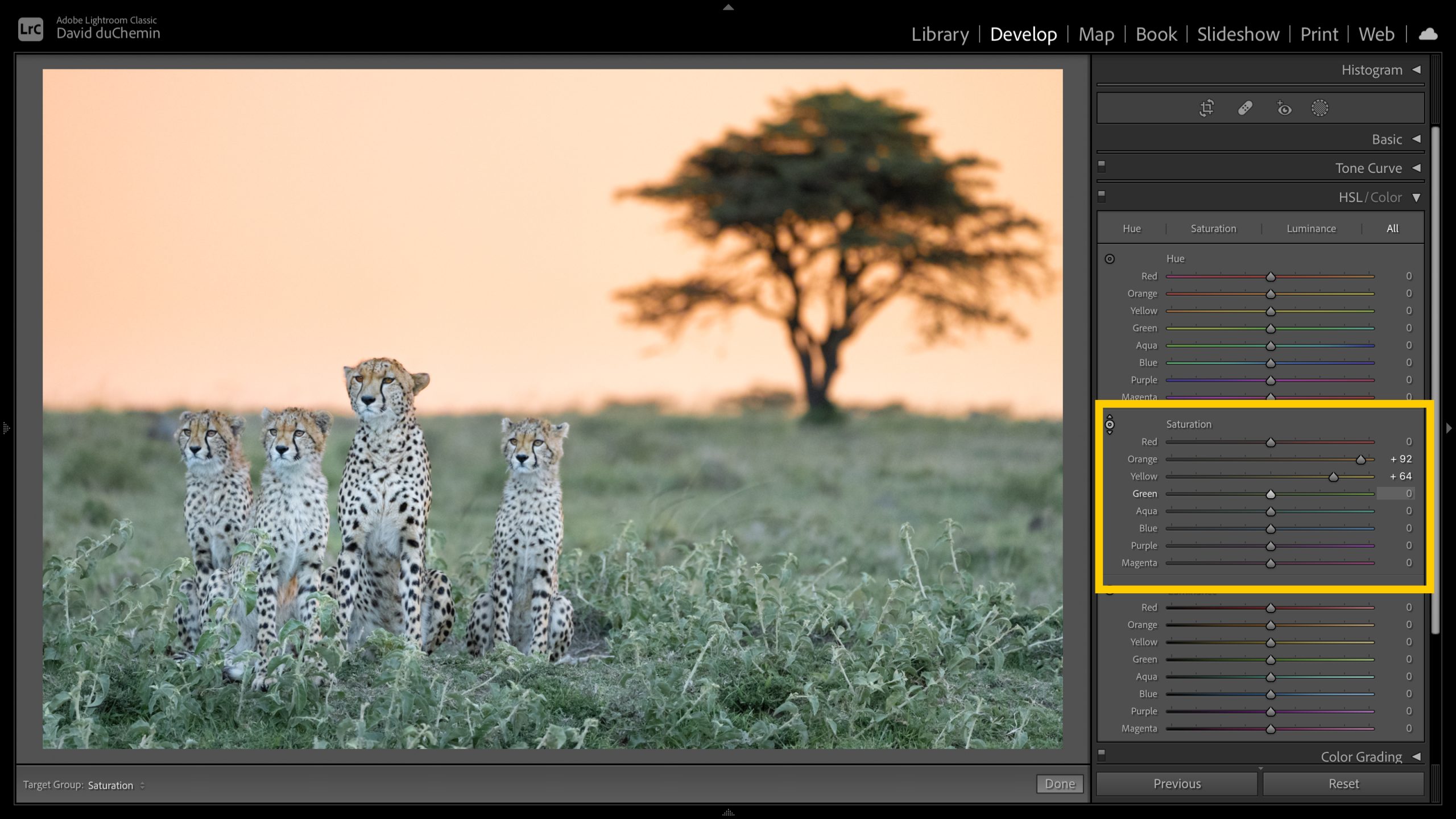
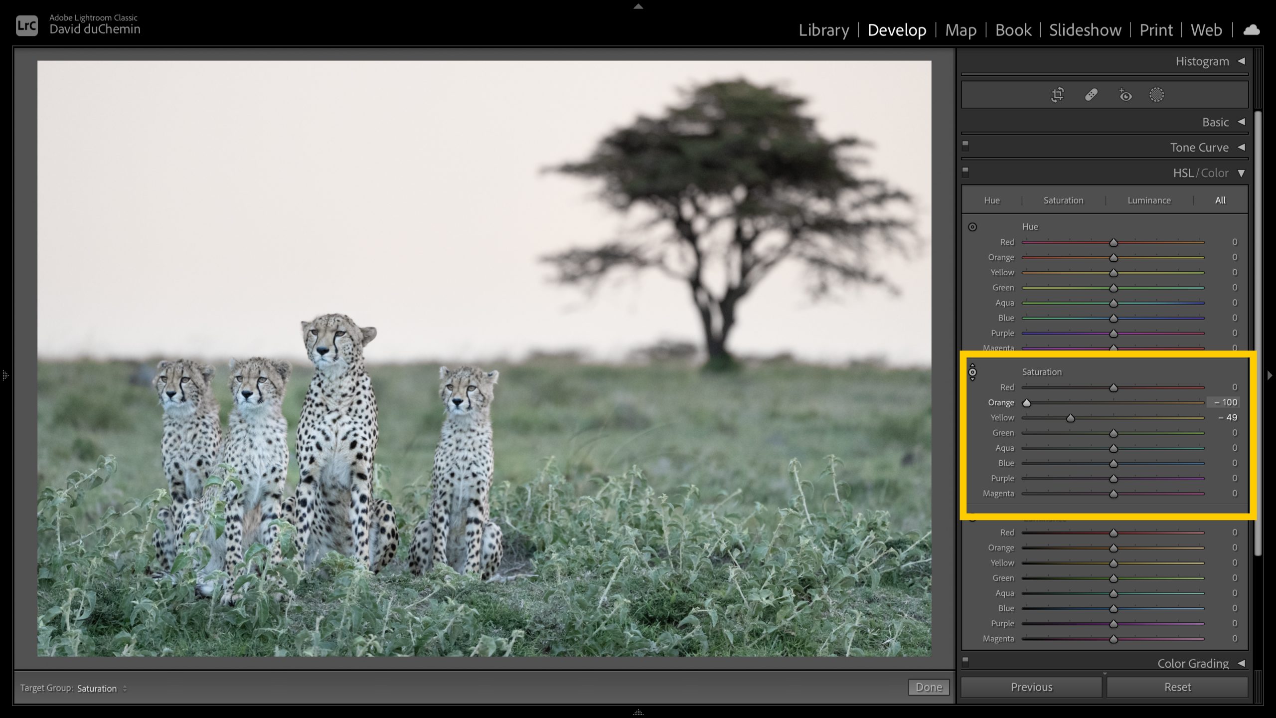
Saturation.
In the Saturation section of the HSL Panel in Lightroom I’ve adjusted the saturation in the same oranges and yellows towards more saturation in the top image and less saturation in the second image.
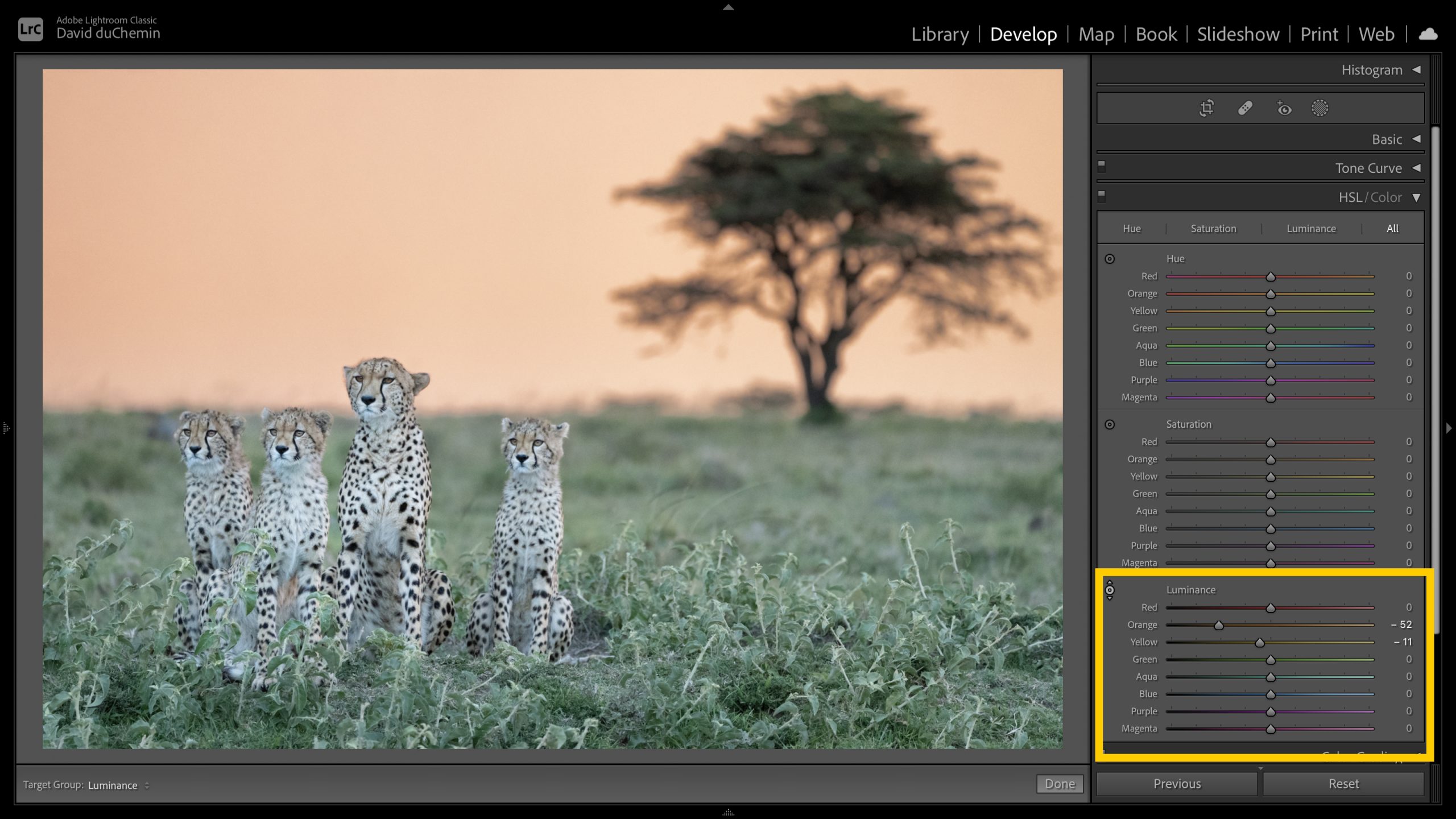
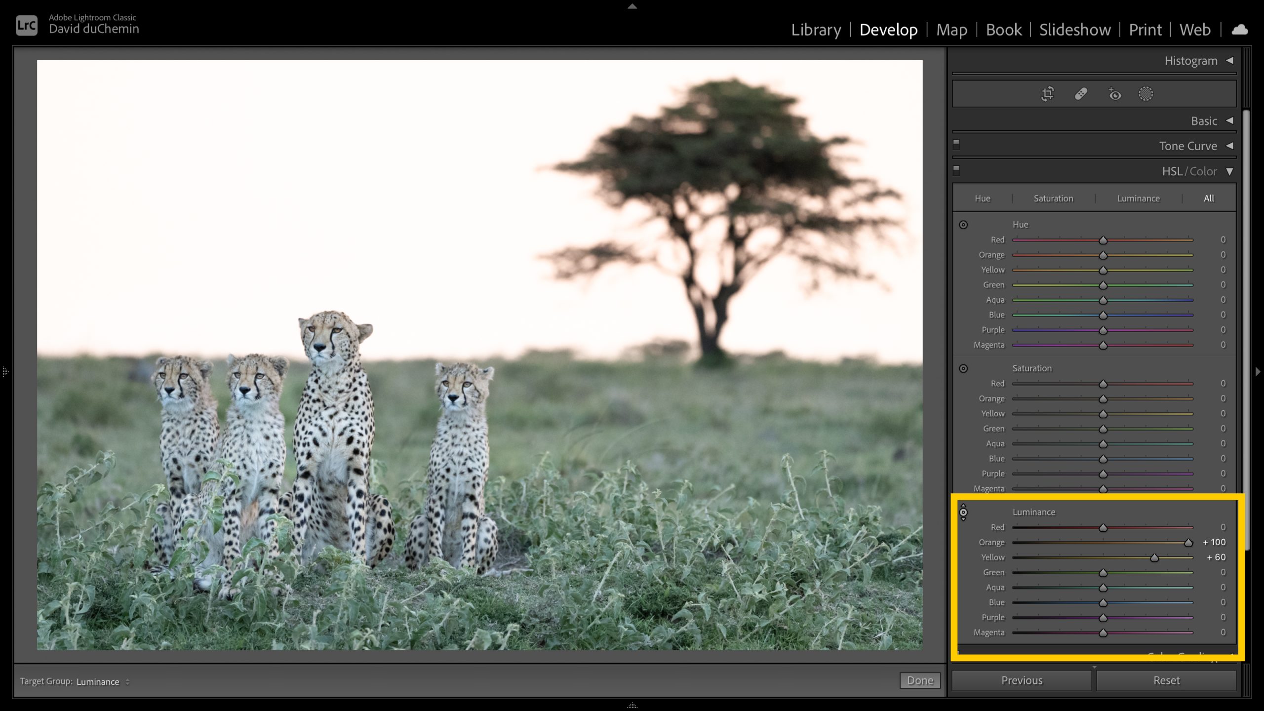
Luminance.
In the Luminance section of the same HSL panel, I’ve darkened the yellow/oranges in the top image and raised the luminance of the same colours in the second image.
There’s much more, of course. If you understand how colours complement each other, you can control the colour contrast or depth by gently nudging these tools one way or the other. If you understand, for example, how cyan contrasts more with orange than it does with yellow, you could use HSL tools to either nudge your cyans toward warmer blues (like violet, which complements yellow) or nudge your yellows toward orange.
Or, if you understand what makes colours work in harmony rather than in tension with each other, you can use the HSL tools to reduce that tension or visual competition by making one colour slightly brighter or more saturated while making other colours slightly darker or desaturated.
There is a lot to know about colour, and if some of what I just described feels a little fuzzy to you, that’s OK. It tells you there’s some room to grow in your use of colour, and I hope to help with that. But just these three ideas alone have changed my personal understanding of colour and of my own photographs, as well as the possibilities that development tools like Lightroom (or others) can offer to make my photographs more expressive—and more mine. I think it can do the same for you.
I’ve created something for you, and tempted as I am to show you now, I don’t want to overwhelm you. So next week I’ll share a 20-minute video for you that explores in greater detail the idea of the photographer’s voice and how your choices with devices like colour can help you create single images and bodies of work that get you closer to that voice. There’s more, too. As I said, I’ve been hard at this for a year, not just as part of my growth as a photographer but also in hopes that I can help you take some of your next steps as you continue learning to make images that aren’t only good, but truly your own.
For the Love of the Photograph,
David
Source link